

Brief:
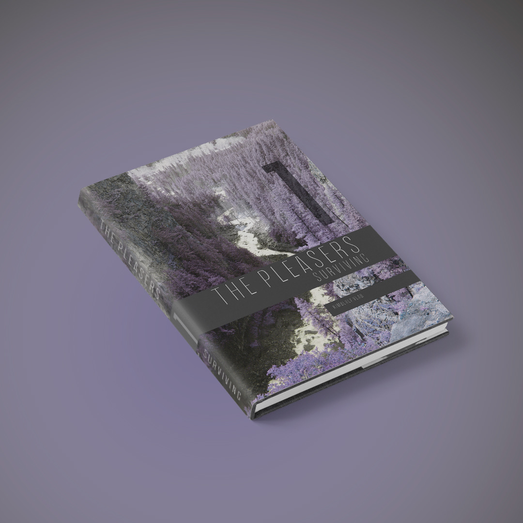
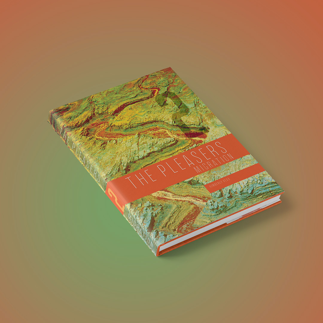
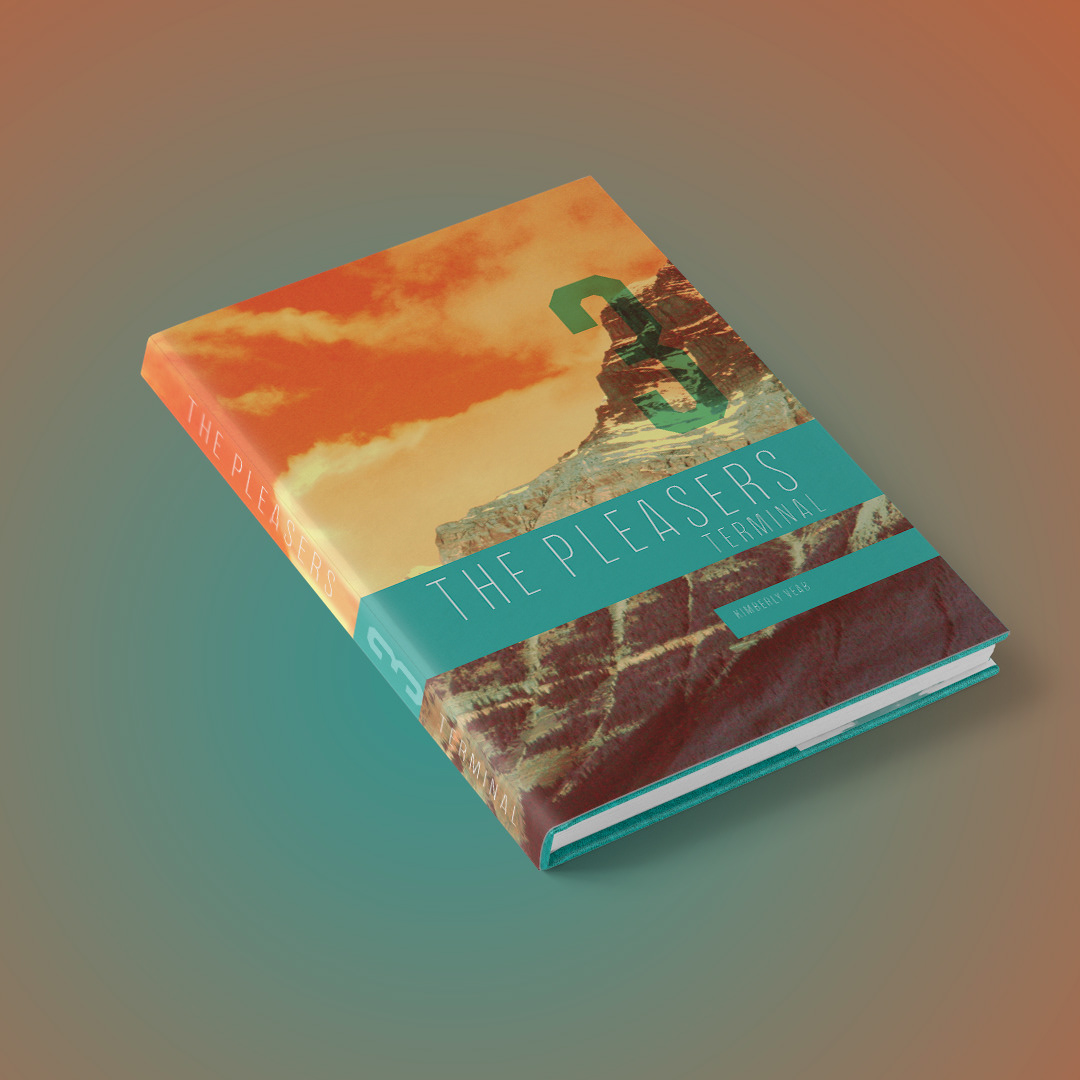
Design dust covers for a 3-volume book series titled The Pleasers. The series follows Sam and Jan Pleaser through a post-apocalyptic world after the collapse of the American government and a pandemic that kills 60% of the population. The covers need to visually reflect the progression of their journey through the chaos, with each volume representing a distinct phase of survival, migration, and settlement.
Design dust covers for a 3-volume book series titled The Pleasers. The series follows Sam and Jan Pleaser through a post-apocalyptic world after the collapse of the American government and a pandemic that kills 60% of the population. The covers need to visually reflect the progression of their journey through the chaos, with each volume representing a distinct phase of survival, migration, and settlement.
Objective:
Create visually cohesive yet distinct dust covers for each volume that capture the dark and oppressive mood of the storyline while illustrating the landscape and setting with a subtle, sinister undertone. Each volume’s cover should reflect the emotional and physical challenges Sam and Jan face, with a visual nod to their evolving environment as they move through collapse, flight, and settlement.
Create visually cohesive yet distinct dust covers for each volume that capture the dark and oppressive mood of the storyline while illustrating the landscape and setting with a subtle, sinister undertone. Each volume’s cover should reflect the emotional and physical challenges Sam and Jan face, with a visual nod to their evolving environment as they move through collapse, flight, and settlement.
Tone & Mood:
Dark, foreboding, and suspenseful, with a sense of survival and resilience. The landscape should feel oppressive, hinting at both natural dangers and societal collapse. Incorporate a sinister feeling that grows with each volume, moving from desperation and uncertainty in Volume 1 to peril and eventual guarded hope in Volume 3.
Dark, foreboding, and suspenseful, with a sense of survival and resilience. The landscape should feel oppressive, hinting at both natural dangers and societal collapse. Incorporate a sinister feeling that grows with each volume, moving from desperation and uncertainty in Volume 1 to peril and eventual guarded hope in Volume 3.
Color Palette:
Gray: Symbolizes the bleak, uncertain world they inhabit.
Orange: Adds intensity and represents the danger, violence, and fire of their struggle.
Teal: Provides contrast, representing fleeting moments of hope, escape, and survival.
Gray: Symbolizes the bleak, uncertain world they inhabit.
Orange: Adds intensity and represents the danger, violence, and fire of their struggle.
Teal: Provides contrast, representing fleeting moments of hope, escape, and survival.
Audience:
Fans of post-apocalyptic fiction, readers interested in stories of survival, resilience, and societal collapse. The covers should appeal to those drawn to dystopian narratives with a strong emotional core.
Fans of post-apocalyptic fiction, readers interested in stories of survival, resilience, and societal collapse. The covers should appeal to those drawn to dystopian narratives with a strong emotional core.
Solution:
To capture the dystopian, post-apocalyptic tone of the series, I used photos from my own travels in the same locations featured in the books and applied a technique that desaturated the natural colors and replaced them with the designated palette of gray, orange, and teal from the brief. Each volume is dominated by one of these colors, serving as the primary hue to reflect its unique theme.
To capture the dystopian, post-apocalyptic tone of the series, I used photos from my own travels in the same locations featured in the books and applied a technique that desaturated the natural colors and replaced them with the designated palette of gray, orange, and teal from the brief. Each volume is dominated by one of these colors, serving as the primary hue to reflect its unique theme.
For the typography, I selected a thin grotesque sans serif font, chosen to symbolize the fragile line between survival and disaster. The sleek, minimalist typeface complements the stark, foreboding visuals, enhancing the overall sense of tension and vulnerability in the design.