Omphalos Co-Working aims to be the epicenter of creativity and collaboration in Redmond, OR. Drawing from the concept of the ancient Greek omphalos, or "navel," which symbolized the center of the world at Delphi, the logo should represent Omphalos as the core of innovative work and a hub of commerce. Redmond itself, known as the "hub" of Central Oregon, aligns perfectly with this vision of centrality and connection.
Objective:
Create a logo mark that visually communicates Omphalos Co-Working as the center of creative and synergetic work in Redmond. The design should balance themes of innovation and commerce, positioning the space as a vital hub for professionals.
Create a logo mark that visually communicates Omphalos Co-Working as the center of creative and synergetic work in Redmond. The design should balance themes of innovation and commerce, positioning the space as a vital hub for professionals.
Tone & Style:
The logo should feel modern, sophisticated, and professional, with a subtle nod to the historical and symbolic origins of the word "omphalos." It should inspire a sense of connection and collaboration, while maintaining a sleek, contemporary aesthetic.
The logo should feel modern, sophisticated, and professional, with a subtle nod to the historical and symbolic origins of the word "omphalos." It should inspire a sense of connection and collaboration, while maintaining a sleek, contemporary aesthetic.
Color Palette:
The primary color should incorporate a gray-blue hue, reflecting professionalism, calm, and focus, while complementing Redmond's identity as a central business hub.
The primary color should incorporate a gray-blue hue, reflecting professionalism, calm, and focus, while complementing Redmond's identity as a central business hub.
Symbolism: The logo should visually represent "the center" or "hub" concept. This can be achieved through circular or central imagery that conveys connection, balance, and focus.
Typography: Clean, modern fonts should be used to evoke professionalism and creativity.
Versatility: The logo mark must work across multiple platforms and formats, from signage to digital use, ensuring clarity and recognition at all sizes.
Audience:
Freelancers, entrepreneurs, small business owners, and creative professionals looking for a collaborative and dynamic co-working space in Redmond, OR. The logo should resonate with individuals seeking a productive, inspiring, and connected work environment.
Freelancers, entrepreneurs, small business owners, and creative professionals looking for a collaborative and dynamic co-working space in Redmond, OR. The logo should resonate with individuals seeking a productive, inspiring, and connected work environment.
Solution:
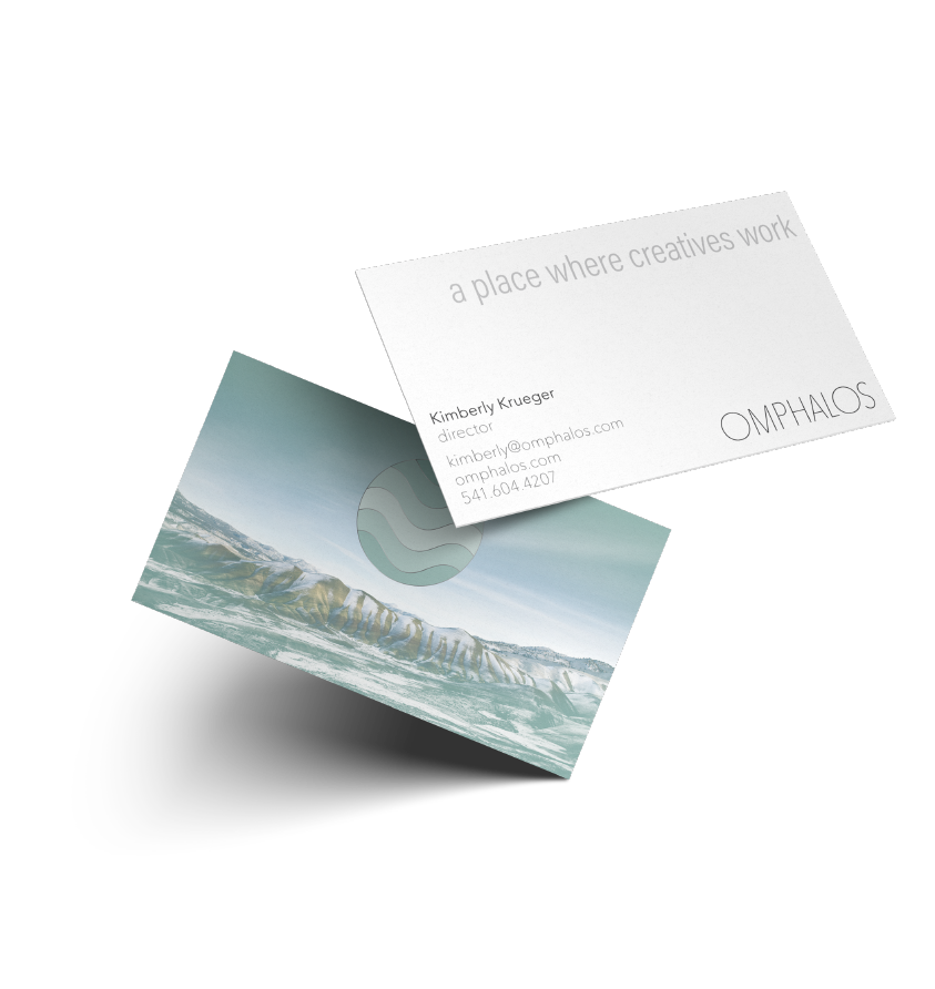
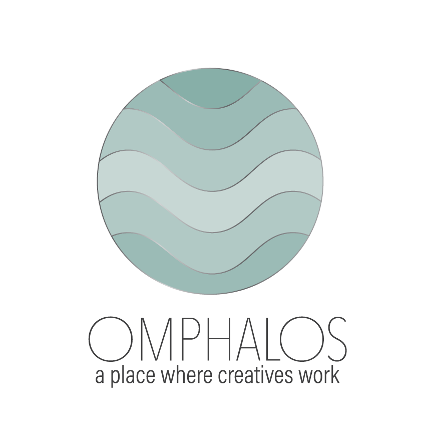
For the logo mark, a circle felt like the natural choice to represent the concept of a central hub. To balance both professionalism and creativity, I incorporated flowing wave elements within the circle, symbolizing the dynamic exchange of ideas. The typography is a clean, sans serif font that conveys both strength and lightness, with the ‘O’ mirroring the round shape of the logo mark to create visual harmony. I also developed the tagline, “A place where creatives work,” to emphasize the space as a hub for high-level creative activity and collaboration.
For the logo mark, a circle felt like the natural choice to represent the concept of a central hub. To balance both professionalism and creativity, I incorporated flowing wave elements within the circle, symbolizing the dynamic exchange of ideas. The typography is a clean, sans serif font that conveys both strength and lightness, with the ‘O’ mirroring the round shape of the logo mark to create visual harmony. I also developed the tagline, “A place where creatives work,” to emphasize the space as a hub for high-level creative activity and collaboration.


